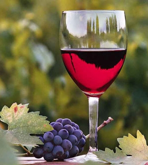
Notice
the above photo of a wine glass. If you've ever wondered how
professionals get such good digital photos, here are a few facts you
might want to remember. First, let's discuss what you don't need to
capture good digital photos rather than what you do need.
You
don't need multi-megapixel cameras that take huge multi-megabit photos.
The filesize of the above photo is 26.9 kilobits.
That's roughly
1/40th the size photo a One Megapixel camera would take. Yep,
it
doesn't look like a 1MB photo would create a file 40 times as
large as
this, does it?
Look at how sharp the edges of the leaves are.
And what about the colors. Outstanding, aren't
they? Here's what you
need to know.
Picture Size is
Unimportant
1)
Megapixels don't create photo quality. Here's what the
numbers in
Photoshop Elements look like for the above wine glass photo:
When
you look at a digital photo on a web page or in an email the size
photo you see is determined by the settings on your screen and the
pixel dimensions of the photo NOT its physical dimensions. An
ideal size photo size for email and
the web is about 700 pixels wide by about 525 high, with a minimum
resolution of 96 pixels per inch.
Smaller photos like the wine
glass cannot be enlarged. If you blow them up they'll look
like the
example below. Some people call this "pixelated."
The
option to enlarge a photo is the main reason those
multi-megabit cameras became popular. But even small
photos will look great if you have the right lens.
The Lens is Everything!
1) The lens, not the
camera's megapixels, make the photo. Cameras with
replaceable lenses, although expensive, take the best photos.
Even
still, there are inexpensive cameras with non-replaceable good lenses.
Here's a photo taken with a 4 megapixel Kodak that cost less
than $200.
I bought the camera for Linda in 2005. She took this photo at
a park in Hoover, Alabama the afternoon we bought
the camera:
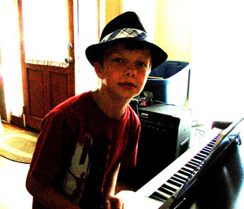
Lighting is Essential
2) You
can't photograph a person in front of a bright window and expect a decent portrait.
They will turn out dark every time. We took
this photo of my grandson wearing his new hat. The camera was
pointed toward a
bright window. When I lightened it in Photoshop Elements it
came out
grainy, artsy looking but not portrait quality. A flash would
have
helped. Shooting from another direction would
have been
better.
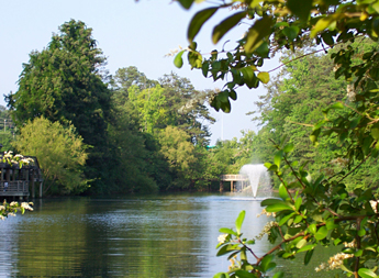
Color
3)
You can sometimes improve the camera's color settings.
Experiment with
the camera's menu to see if it has color settings that can be adjusted.
Of course, nothing beats chosing a colorful image and taking
the photo
in the correct light. Here's a lucky shot we got with just
the right
color and lighting while we were traveling out west:
The
time of day the photo was taken made all the difference in the color and lighting.
Of course we also discovered you can't take sharp or colorful
photos
through the windshield of a traveling car.
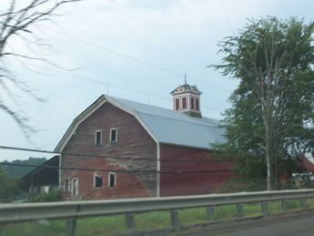
Phrame the Photo Phirst
4)
Correct lighting and color are important but most important is framing
your photo.
That means
stop all motion including the subject if possible, choose the right
spot to stand with your camera (for lighting and proper framing), and
keep the
camera absolutely motionless while taking the picture.
There are
all sorts of things wrong with this photo of an old barn in Vermont.
We were traveling 55 mph. We shot the photo through
the car window.
If we had stopped and kept the camera motionless, the photo
would have
had the same rich color as in the photo of the lake above (it was the
same camera). We did not frame the photo. Choosing a
different angle might have eliminated the telephone lines and guard
rail.
Edit the Photo If You
Have Editing Software
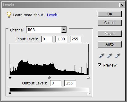
5)
Here's a tech trick I learned if you have Photoshop Elements.
It's
called the "histogram." This is the histogram of the wine
glass photo.
It represents the "luminosity" (brightness) of principle
colors: red,
green, and blue, and the amount of light in the photo's
highlights, shadows, and mid-levels.
In a nutshell, if your histogram is spread out (with no empty spots), the overall
contrast of the photo will look fine. If not, the photo's
lighting can
be adjusted slightly by dragging the white arrow (makes highlights
lighter) or black arrow (makes shadows darker) more toward the center.
The goal is to drag the white and black arrows more under the
higher
end-points of the histogram without washing out the photo.
A
free photo editor, Irfanview (http://www.irfanview.com/) will make
similar adjustments if you can't afford Photoshop Elements.
Unfortunately, Irfanview does not selectively adjust the
luminosity (brightness) of shadows or midtones while leaving highlights
as-is the way Photoshop Elements does. In Irfanview, you can only
adjust what they call "gamma" which auto-adusts the shadows and
midtones together. Beware that, although making these adjustments
will let you see an otherwise dark subject on a bright background, it
will also make your photo very grainy looking. See #2 above
"Lighting is Essential."
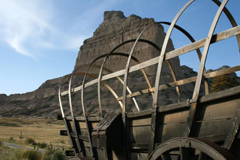
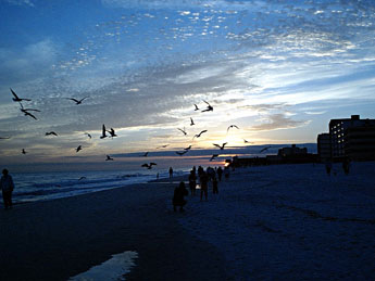
An Inexpensive Example
In
closing, let me show you this photo taken at sunset on the
coast.
I took this with a Samsung Digimax 200 digital camera in
2003.
The
camera had a Carl Zeiss lens and cost less than $200. It
would
take a
maxium photo size of 2.1 megapixels. The camera was slow as
could
be.
It was very annoying having to wait for 1/2 a minute or more
between shots. If I waited more than 2 minutes
between
photos it
would turn itself off and I'd have to wait two more minutes for it to
boot up. But the picture quality was top shelf for digital
cameras
back then.
You can see a great example of what another inexpensive camera can do
by clicking HERE.
~ HIT YOUR BROWSER'S BACK BUTTON TO RETURN TO THE MAIN PAGE ~